Amazon Pay Gift Cards Store Revamp
Research & Insights
User behavior data and session analytics indicated high drop-off rates. Initial assumptions pointed to technical or transactional issues, but qualitative research revealed a different story.
We conducted 20 in-depth user interviews across Mumbai, Delhi, Nagpur, and Varanasi, focusing on Android users aged 18–45 from diverse backgrounds.
Key Findings:
- Navigation was unintuitive — users expected a simpler hierarchy.
- No search option limited quick access.
- Redemption steps weren’t visible until the end of the funnel.
- Too many entry points caused choice paralysis.
Key Pain Points:
Design Process
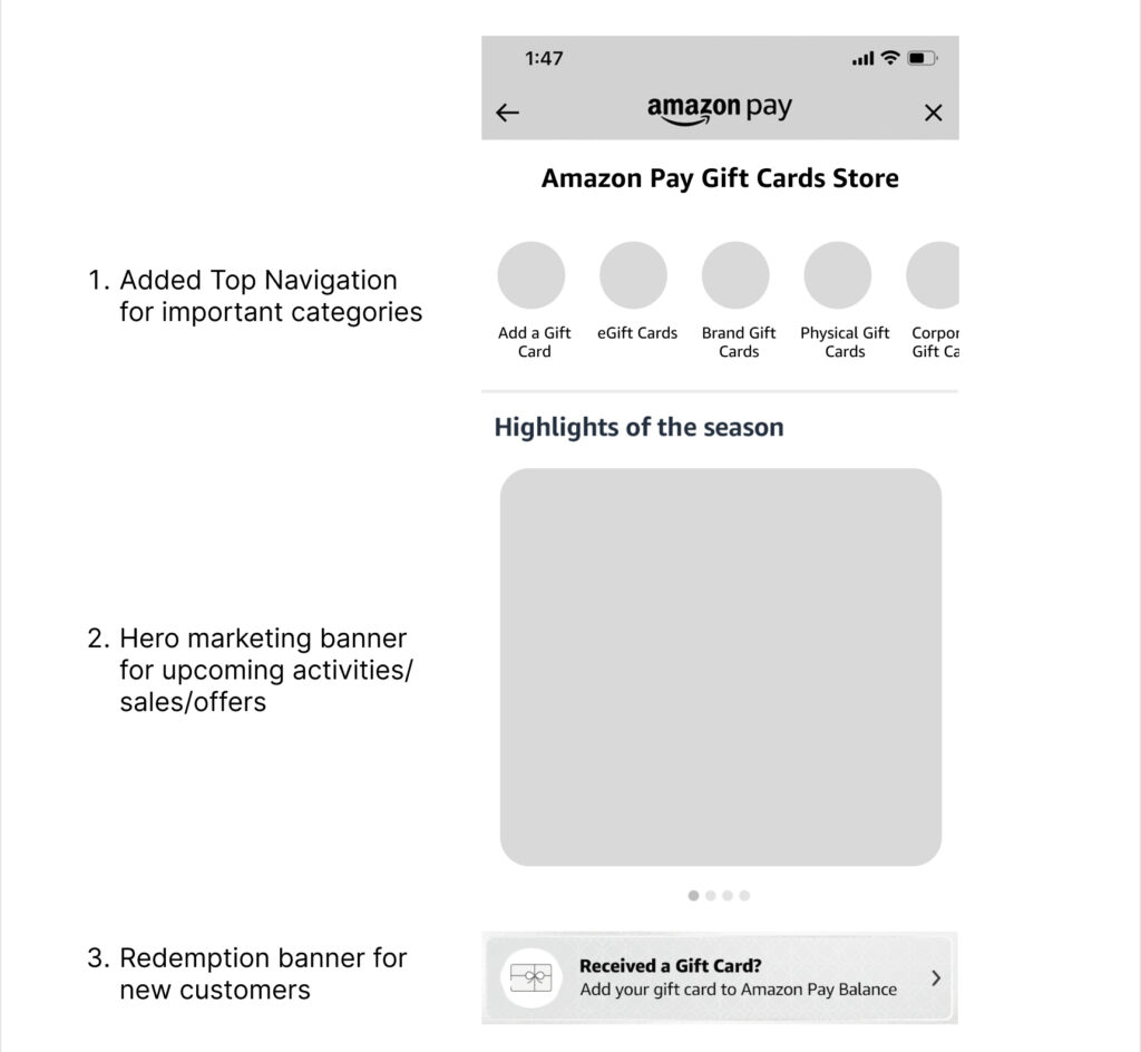
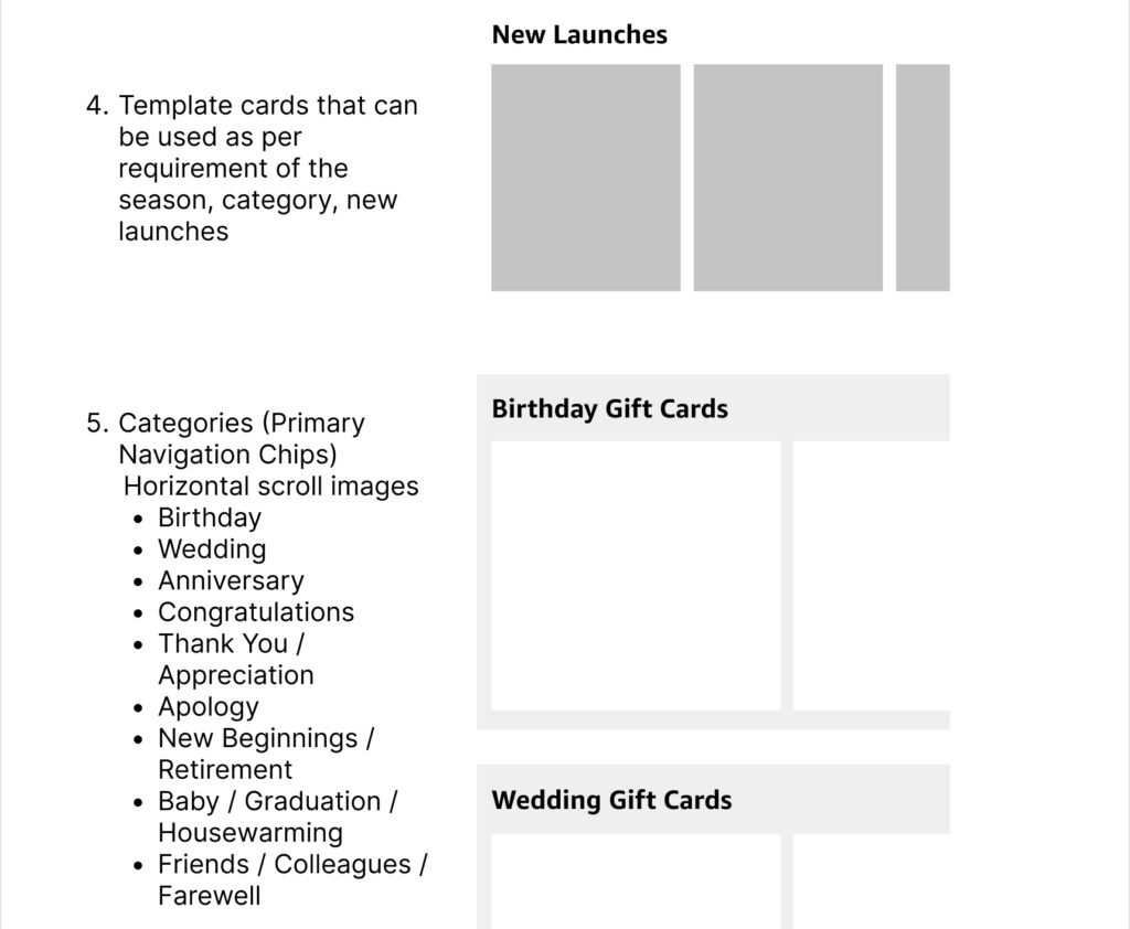
1. Information Architecture Overhaul
I restructured the IA(Information Architecture) of the Gift Card store. I created a rough wireframe of the page based on the new IA(Information Architecture). After stakeholder’s alignment started working on the digital mocks.
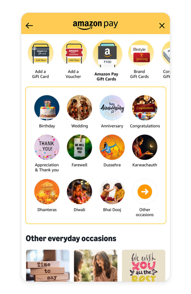
2. Navigation Redesign
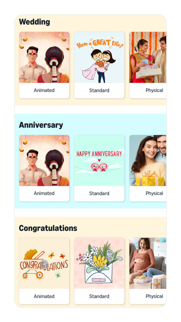
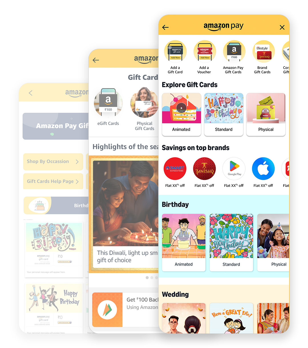
- Replaced vertical stacks with horizontal scrollable chips
- Added sub-navigation for quicker segmentation
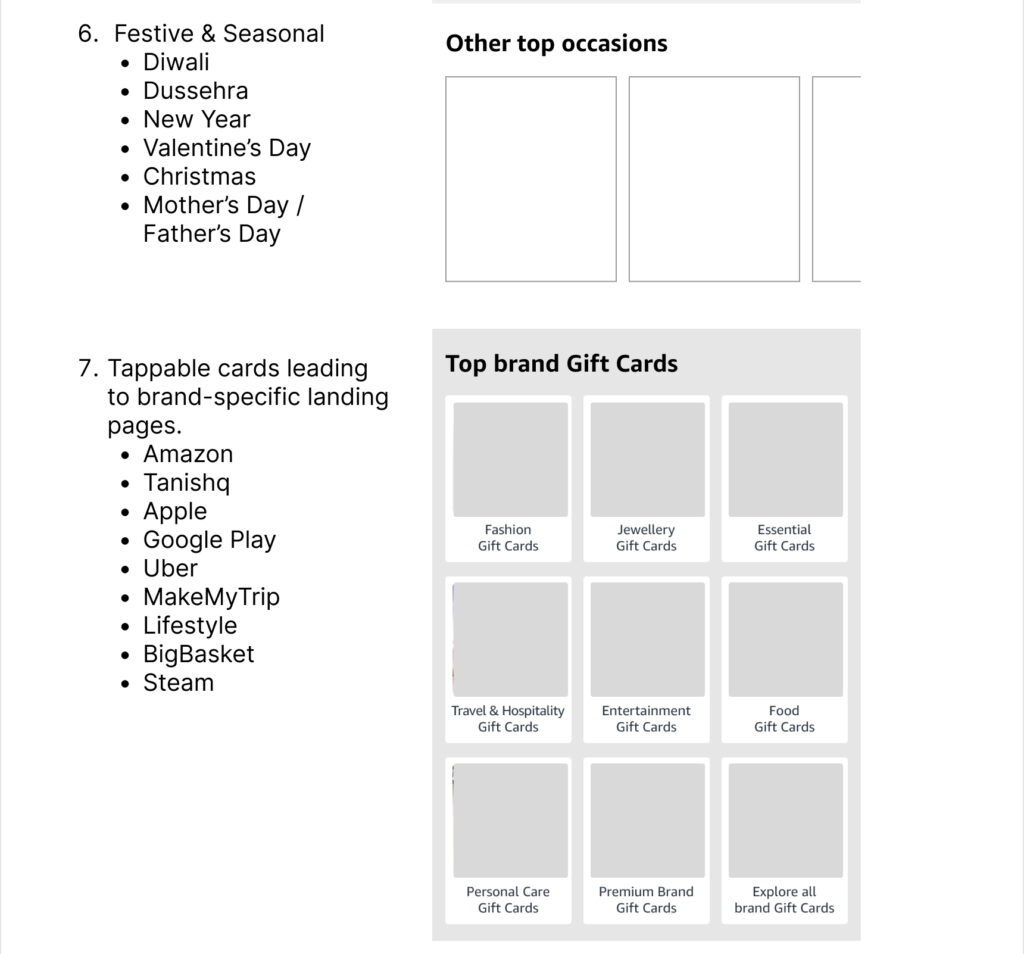
- Created horizontal category scrollers for easier discovery
- Introduced ATF carousel for top gift cards/seasonal picks

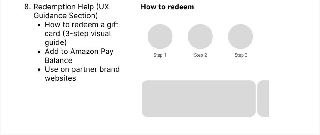
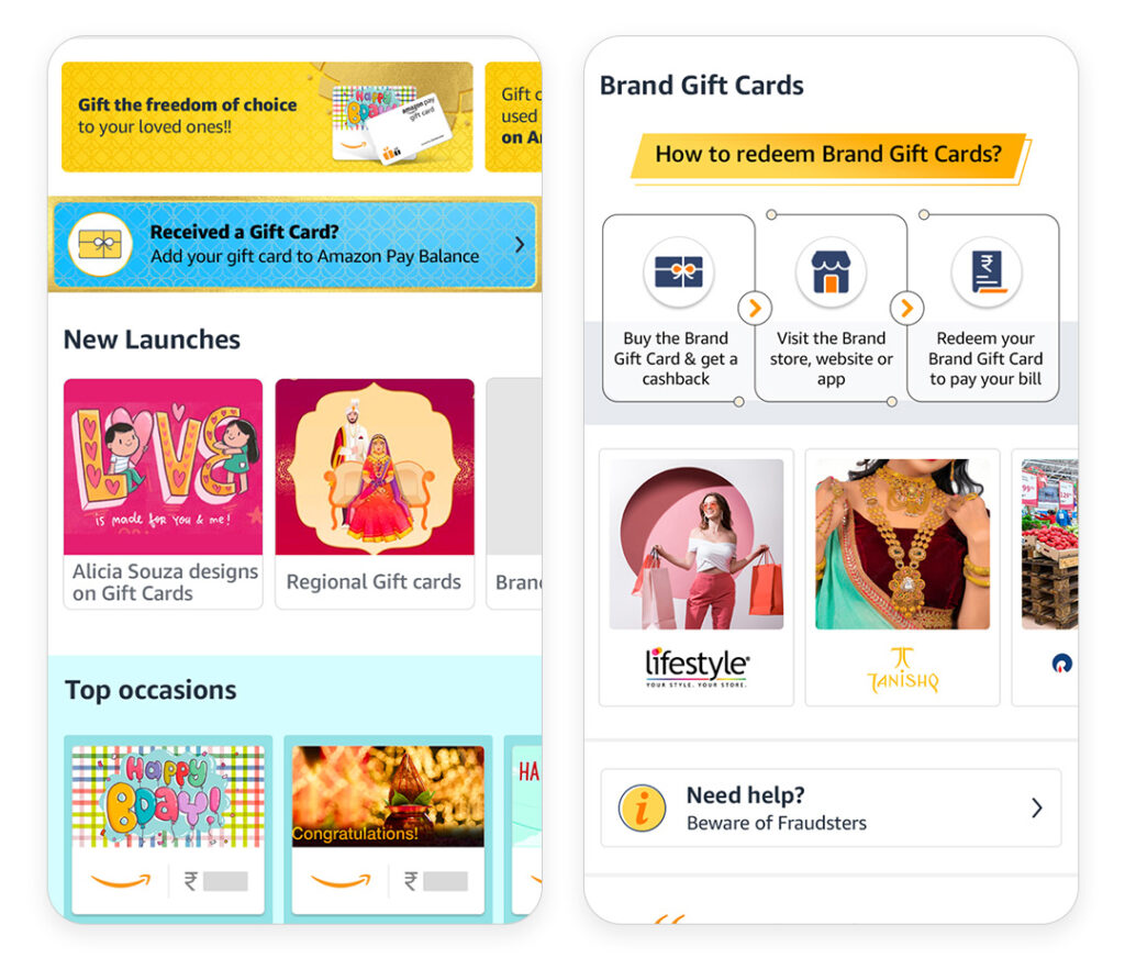
3. Redemption Clarity
- A slim redemption banner was added in the 2nd fold
- Clear, visual steps in the “How to Redeem” section
- Tooltips and icons for guidance
4. Visual & UX Enhancements
- Improved contrast and visual hierarchy for accessibility
- Integrated seasonal storytelling visuals (e.g., Diwali)
- Simplified category system
- Consistent navigation patterns