APP Landing Pages Revamp
Project Overview
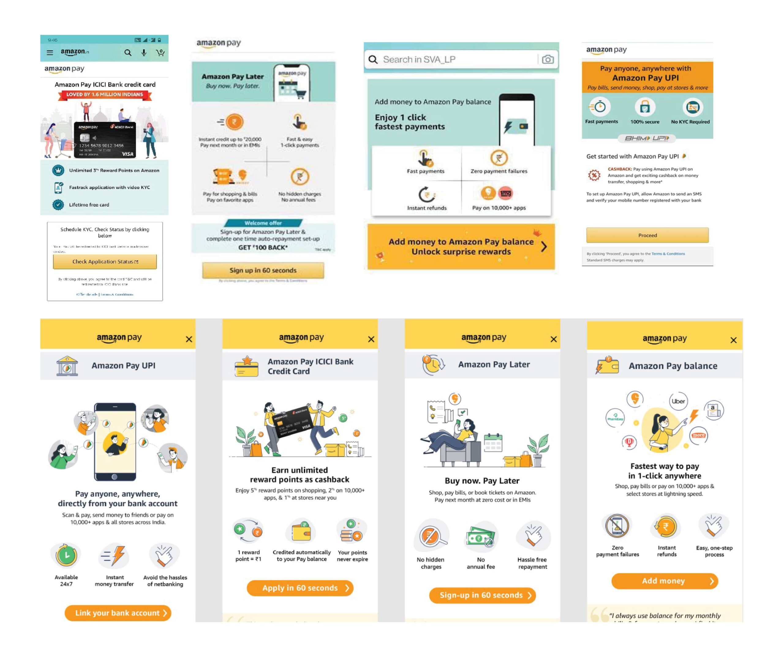
The N2APP pages refer to the 4 APP pages exposed to customers who
are completely new to the Amazon Payment Products. The Project aims at
defining APP proposition with clarity & creating consistent communication while
differentiating thus persuading customers to engage with APPs.
Project Duration: Q1 2023
Design Process
1. Empathize
I collated the existing pages and collaborated with the user research team to identify the user pain points of customer.
| Current Gaps | How are we addressing it? |
| Lack of Information architecture. Challenge lies in structuring of information, not lack of it , not persuasive enough. “Customers read less, visually grasp more” – Voice of expert. | Create sharp content hierarchy. Building blocks : CARDS approach .via the Amazon Pay pillars ( Trust, Convenience, Rewards) and be consistent to build memory. |
| Customers focus only for 5 seconds. Global insights clearly indicate that we need to make ATF self sufficient. Key information is either revealed too late in the flow. 80% drop off after ATF. | ATF to be self sufficient w.r.t persuasion. Compelling reason (Proposition) – Why should I chose xx? Reason to believe , Instant gratification. |
| Messaging with high cognitive load. Too much assumed knowledge on the part of the customer and not meant for low .English proficiency customers. high cognitive load. | Adopt story telling via infographic approach. Use supporting visuals that bring alive the emotions/lifestyle and benefits. Simple English that passes the 7th grade test. |
| Task flow low on persuasiveness. Customers don’t feel the urgency or need to take action on the particular page. | Add blocks of persuasion. Add more blocks of persuasion. Each block can potentially add more reasons for customer to be persuaded to engage. E.g. rewards, offers, cashback. |
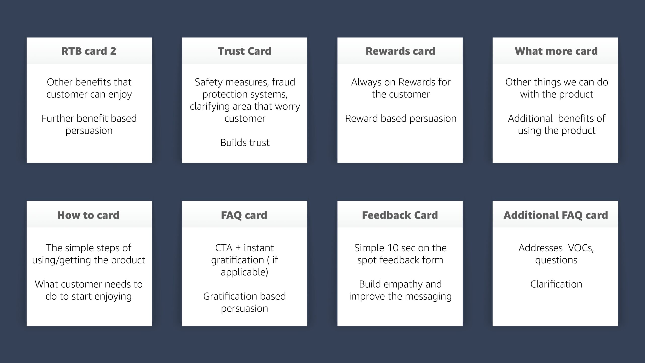
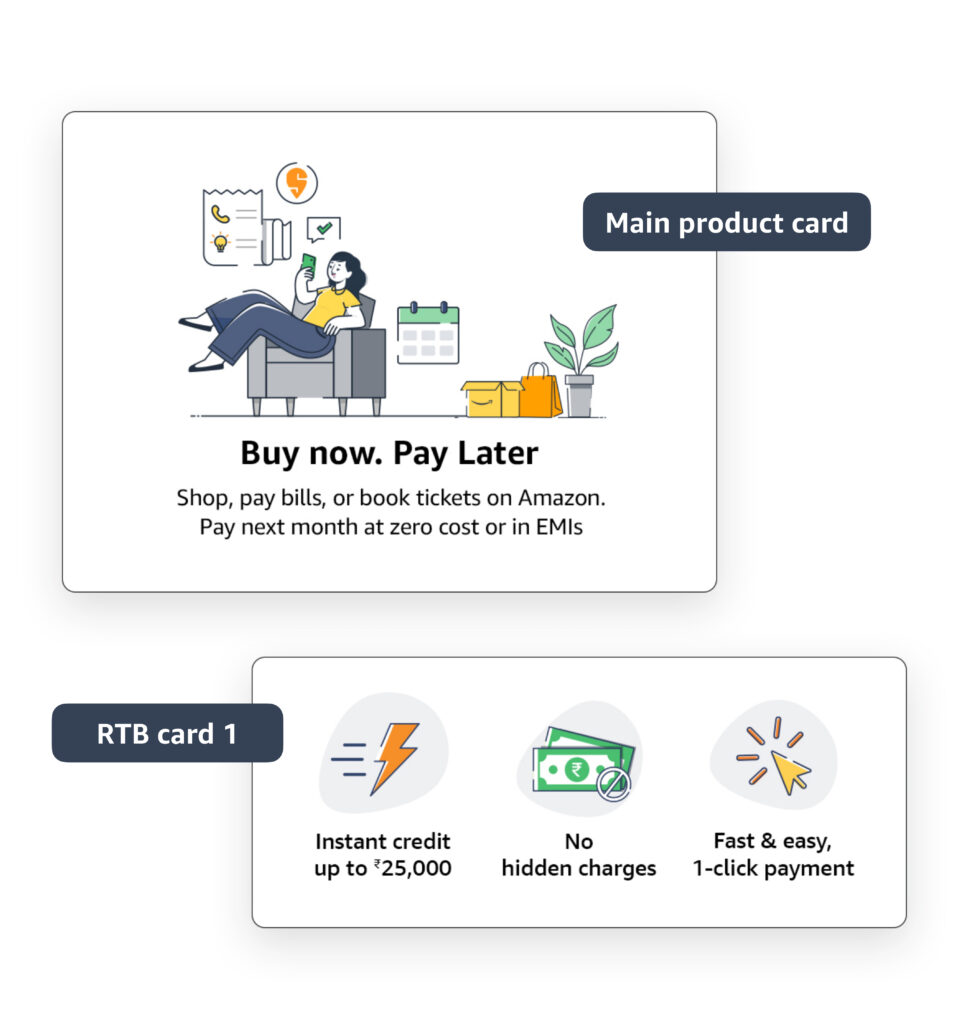
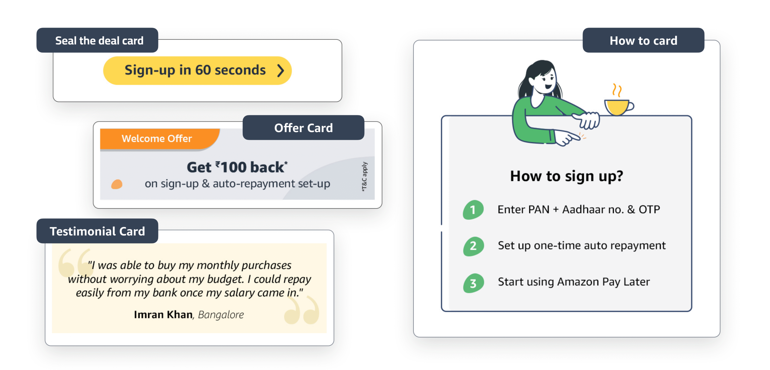
2. Define Cards
What was the
proposed thinking?
Defining the 12 cards – Modifying the existing content, we collated all the information and defined 12 cards to create a sharp, differentiated and
consistent communication.
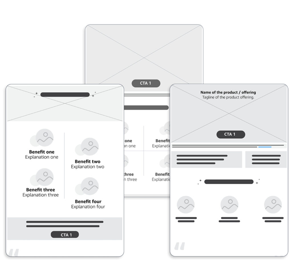
3. Visualisation
Digital Wireframes
I created multiple variation of digital wireframes during the initial phase keeping in mind about the cards structure. Also I created few different approaches of the ATF
cards.
I focused on creating the layout of the landing page very flexible where each components/card can be easily moved or changed.
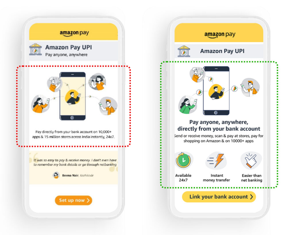
High fidelity (hi-fi) digital design
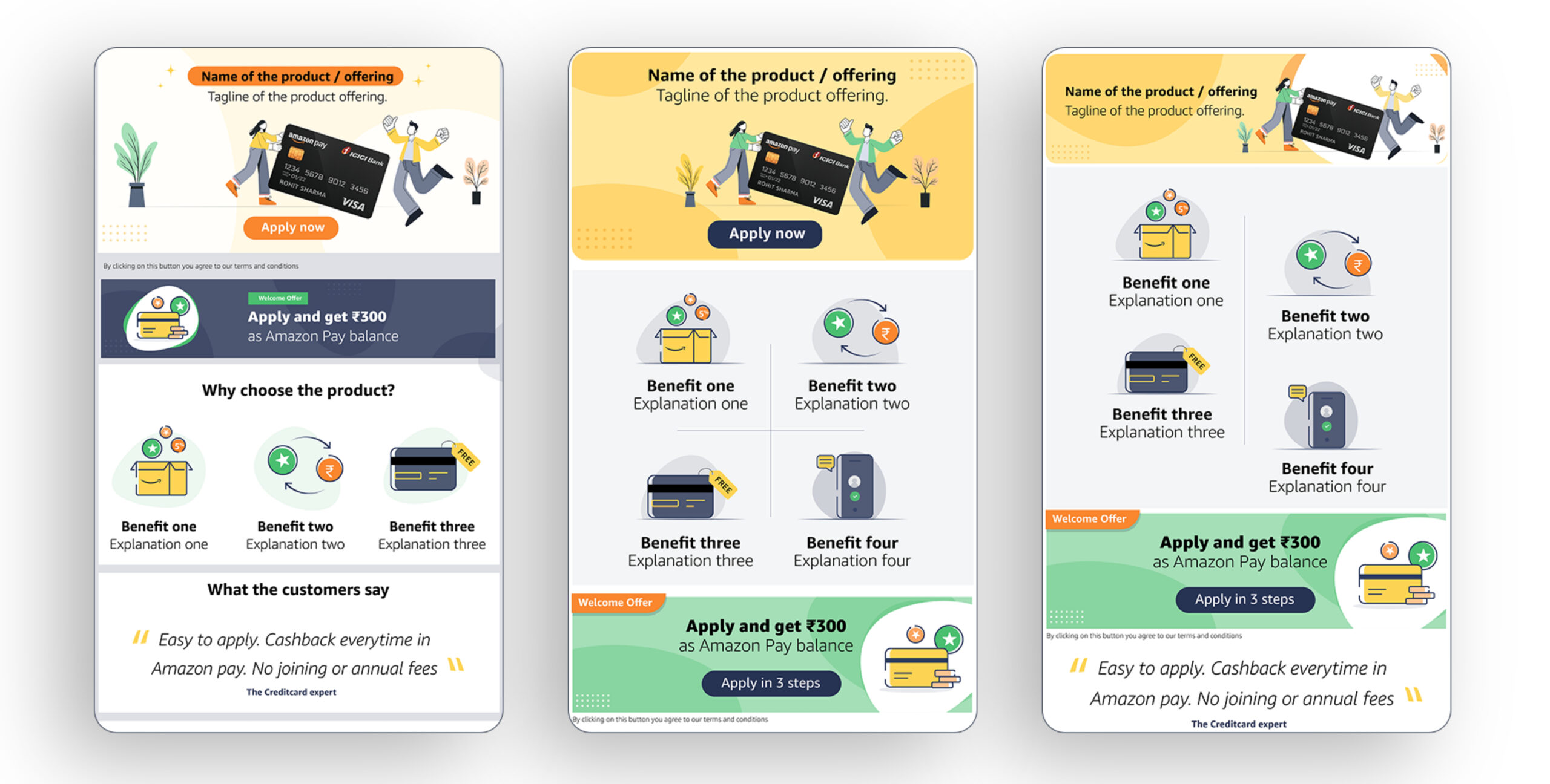
Card based visualisation
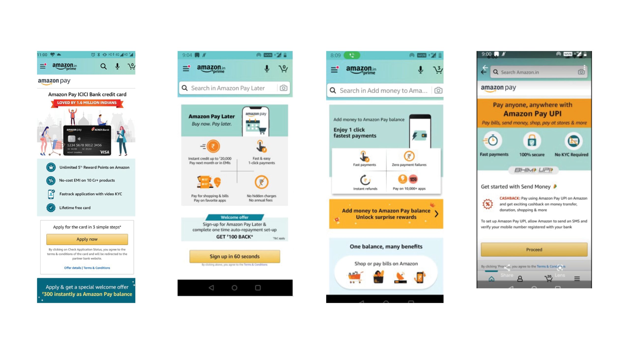
After presenting the initial designs with leadership, I further iterated the mocks incorporating the feedbacks shared by leadership and created all the 4 landing pages and shared with the stakeholders for usability testing.
Amazon Pay Later LP Mock: high on recall & comprehension clarity.
4. Usability Study
What did we test?
What did we learn?
Key Insights
Principle of Clarity
ATF to be razor sharp focused on
- Differentiating benefit
- Reasons to believe the benefit
- Imagery to connote on emotional benefit (e.g. excitement of rewards, convenience of easy paying)
Principle of Attention:
Placement of key info in sync with attention of customers
- All CTA to be closer to thumb
- .Critical information to be focused on the central 50% screen space
5. Design Iterate
Eliminate CTA from top. keep closer to thumb
3 benefits worked harder vs. text heavy testimonial
Proposition to appear in the central screen ( proposition, benefits)
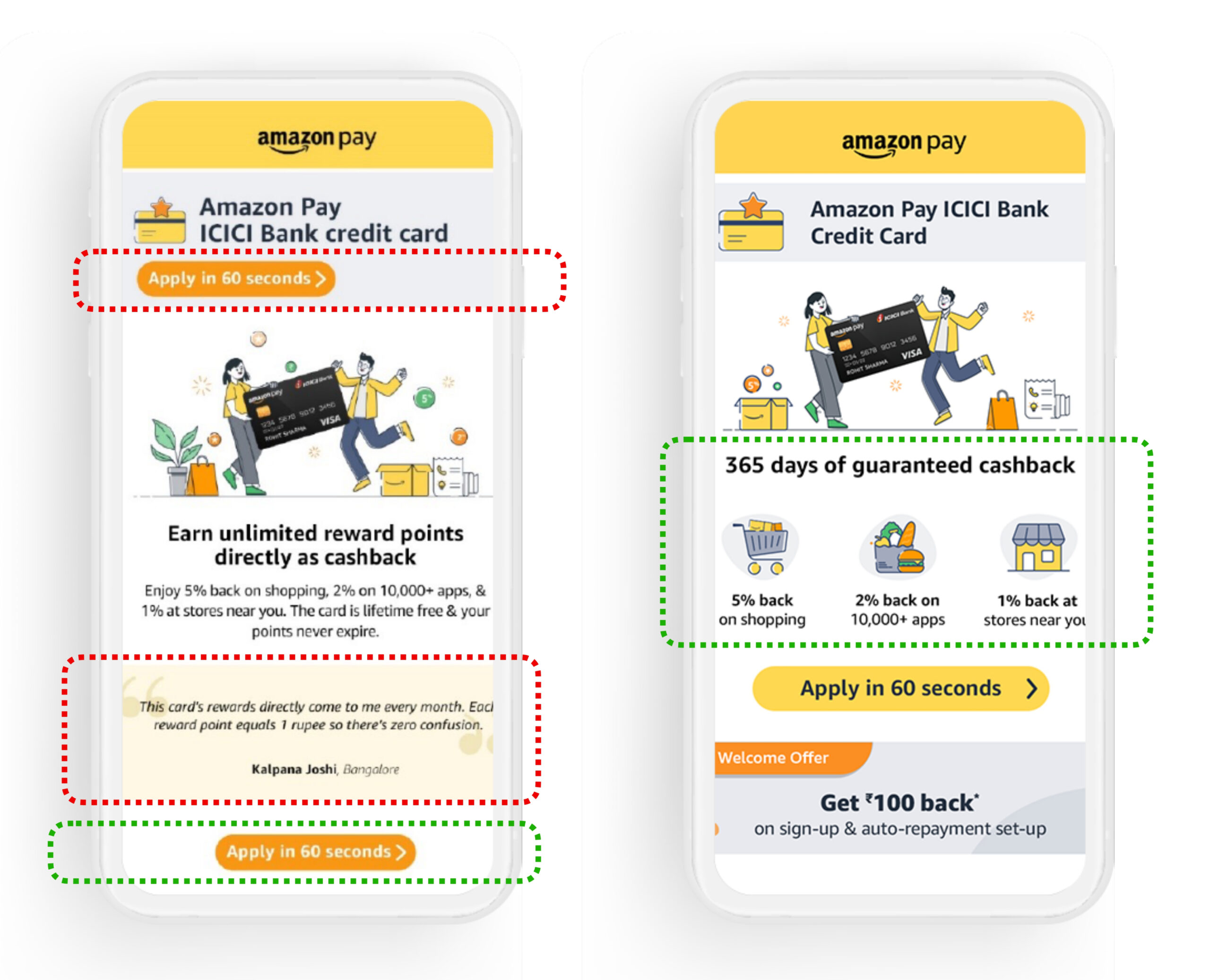
Less cluttered image works better so I reduced image clutter in all the pages
6. Leadership Approval
I presented the iterated mocks with leadership and got a go ahead for weblab/AB testing
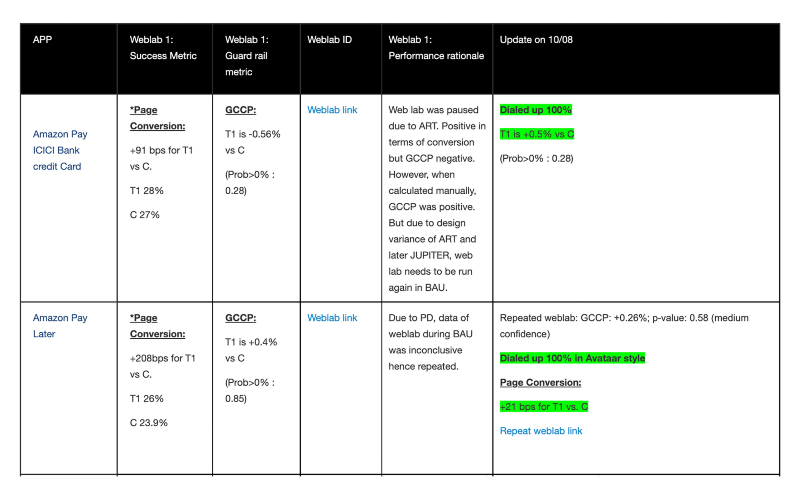
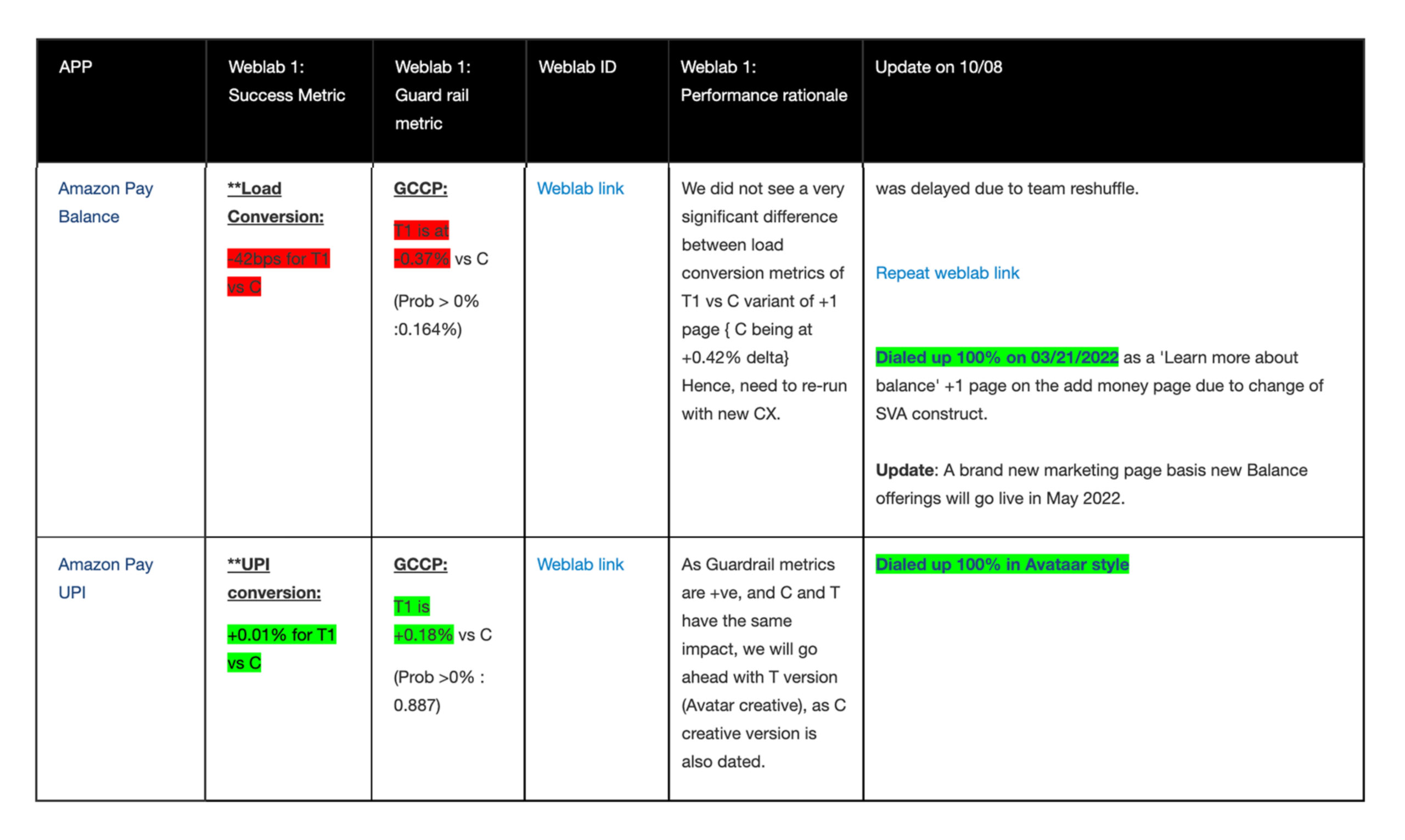
Results