Visual Design System for Amazon Pay
Project Overview:
Project Avataar was focused on creating a cohesive and scalable visual design system for Amazon Pay. The goal was to craft a visual language that could enhance usability, resonate with younger users, and build trust—while staying aligned with Amazon’s core brand values.
Project Duration: Q1 2022 to Q2 2022 (6 months)
The Problem:
Amazon Pay’s user engagement was declining, particularly among younger demographics, due to an outdated and cluttered interface.
The Goal:
Create Amazon Pay’s visual design to increase user engagement, appeal to younger users, and maintain brand trust with a consistent and scalable design system.
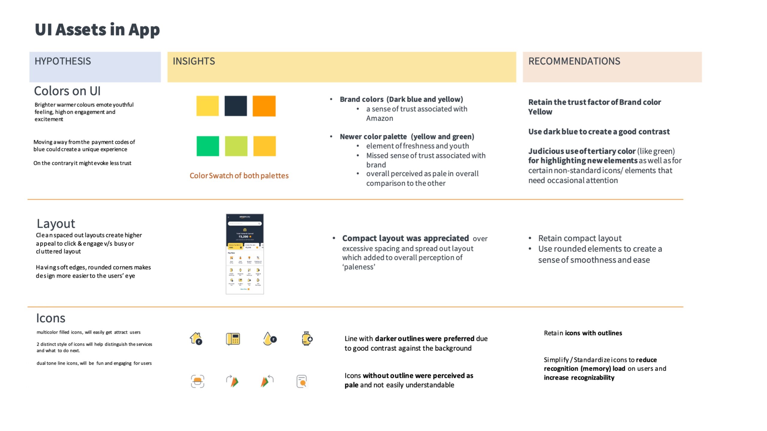
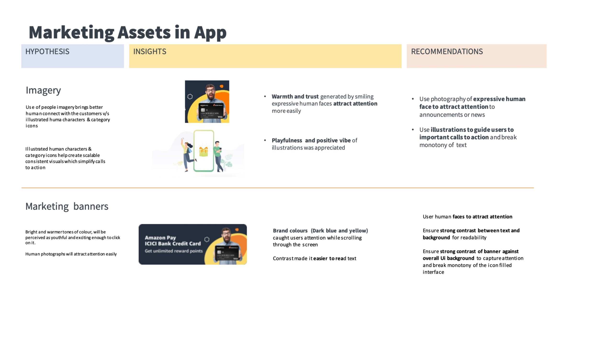
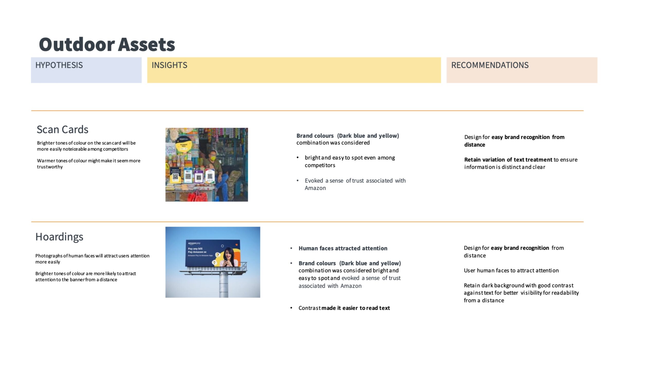
Design Process
1. Analysis
Amazon Universe:
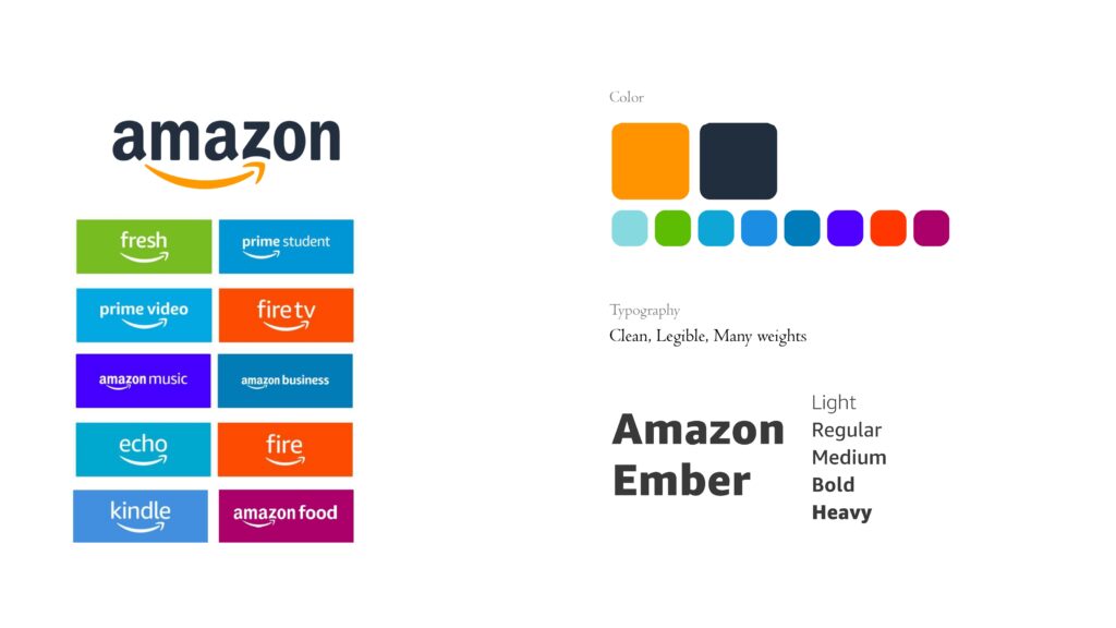
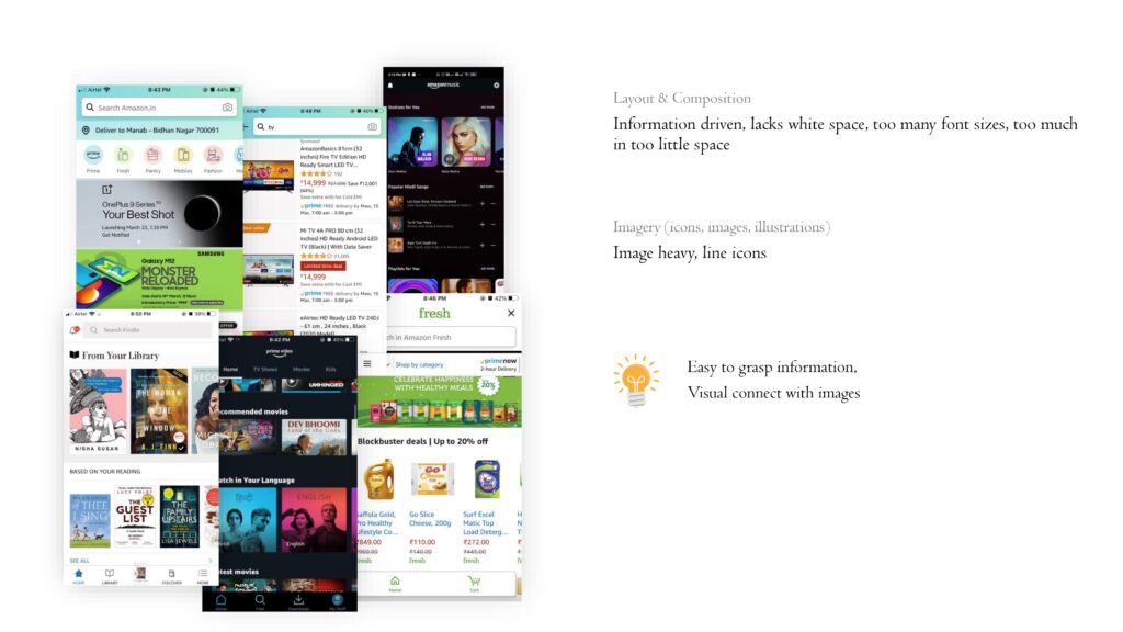
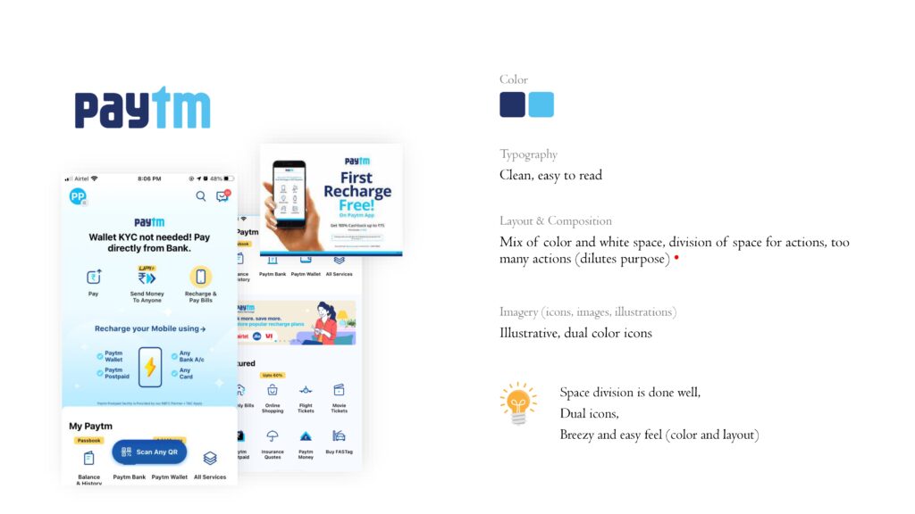
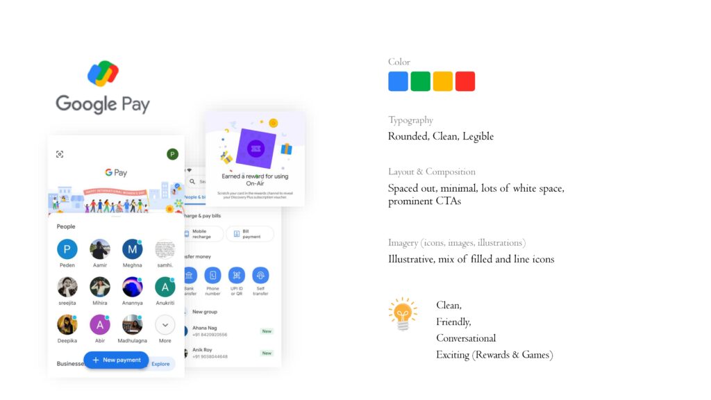
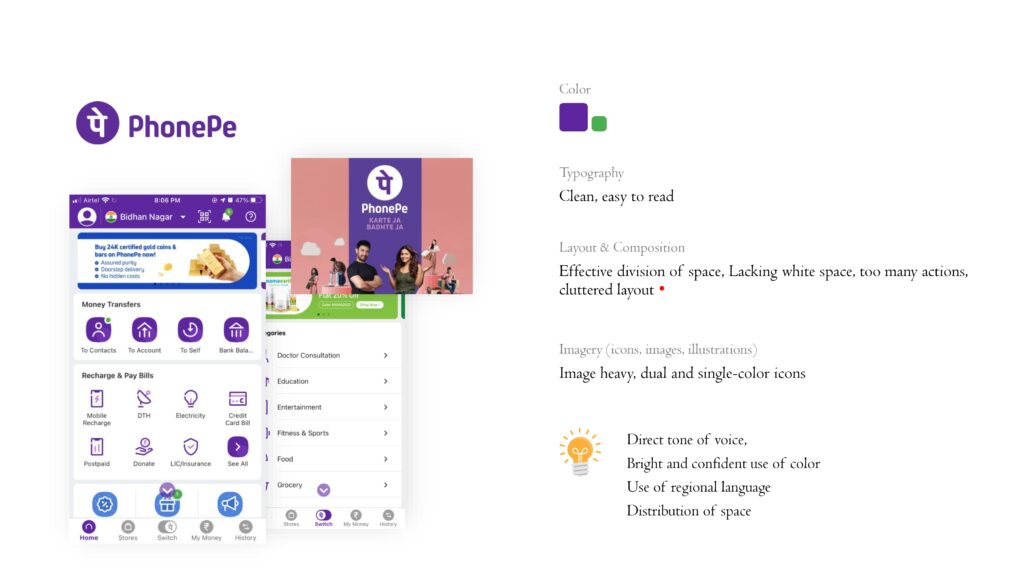
Key Visual Takeaways:
2. Explorations
Brand Attributes Keywords Foundation:
Brand attributes are the core qualities or characteristics that define a brand’s personality, values, and tone—basically, how the brand wants to be perceived by its audience.
These attributes guide everything from visual design to messaging, tone of voice, and user experience. Think of them as the human traits of a brand.
Brand attributes shape visual decisions like:
We want Amazon Pay as a brand to be?
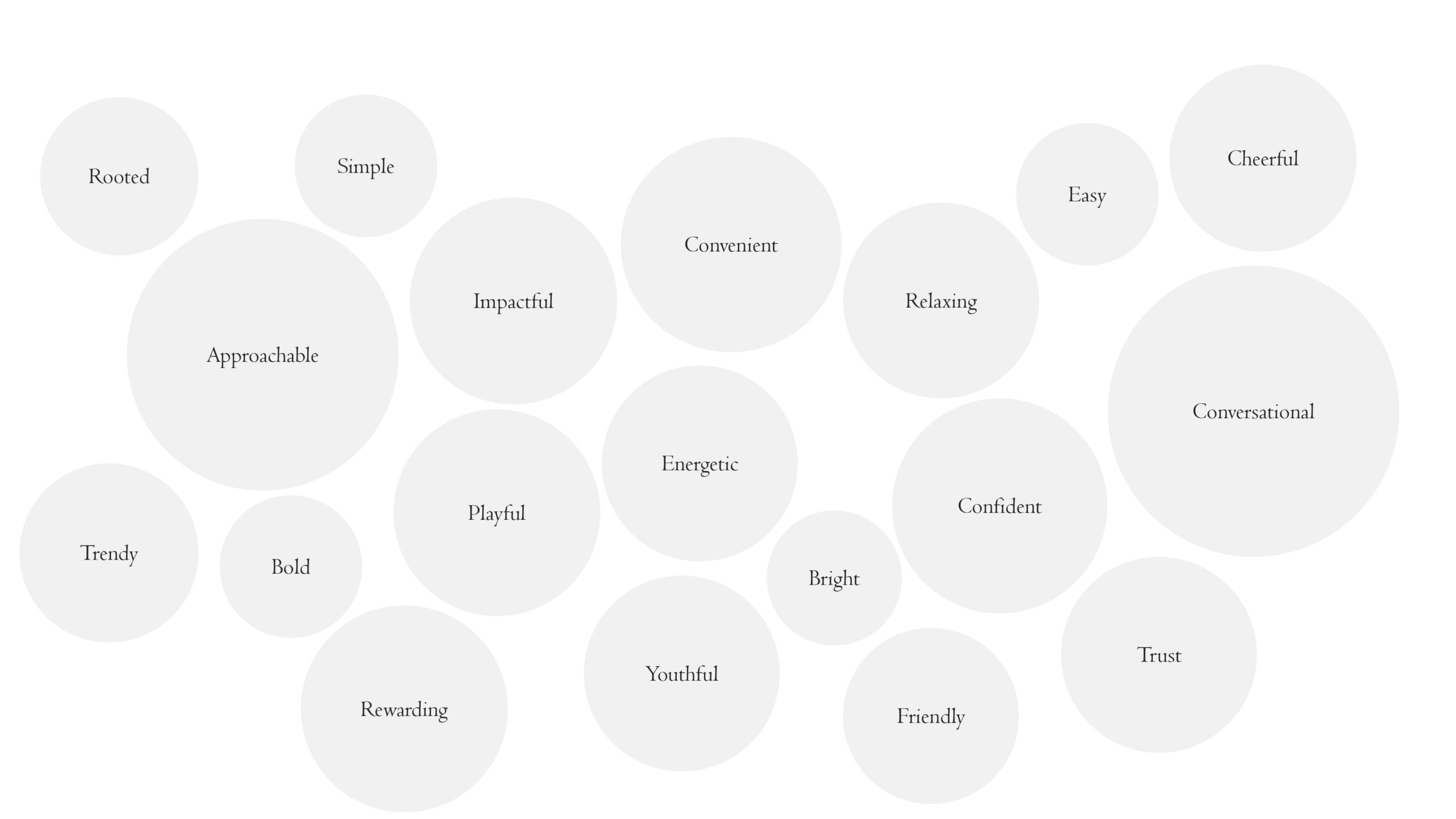
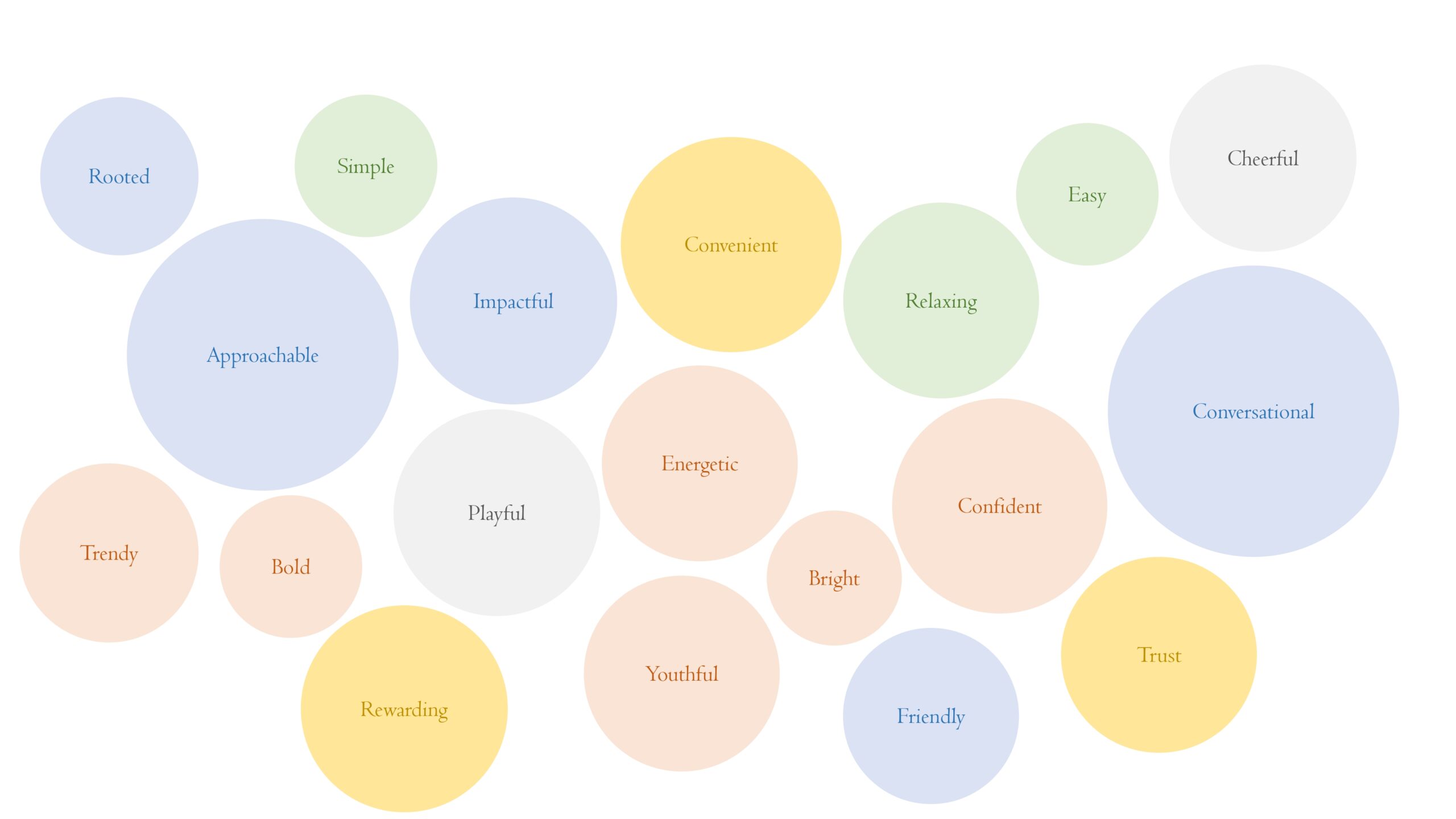
Developed moodboards aligned with brand attributes like:
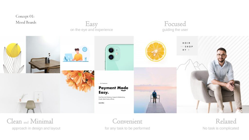
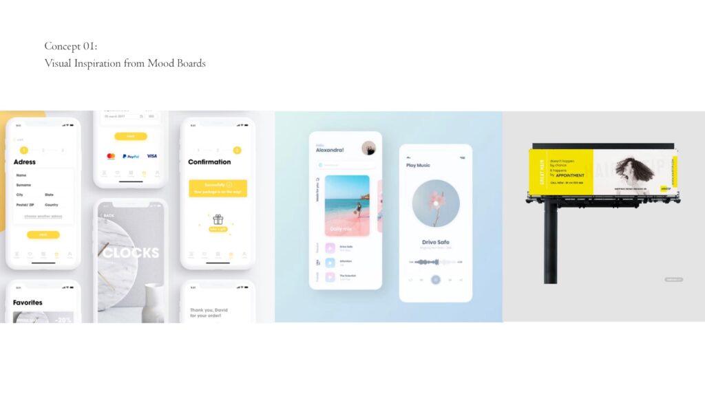
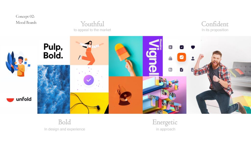
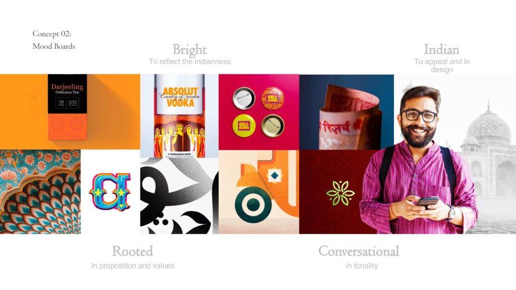
Exploration of Concepts: Moodboards
| Concept | Keywords | Vibe |
|---|---|---|
| Concept 01 | Simple, Relaxed, Easy | Clean, Minimalist UI |
| Concept 02 | Bold, Energetic, Trendy | Youthful, High Contrast |
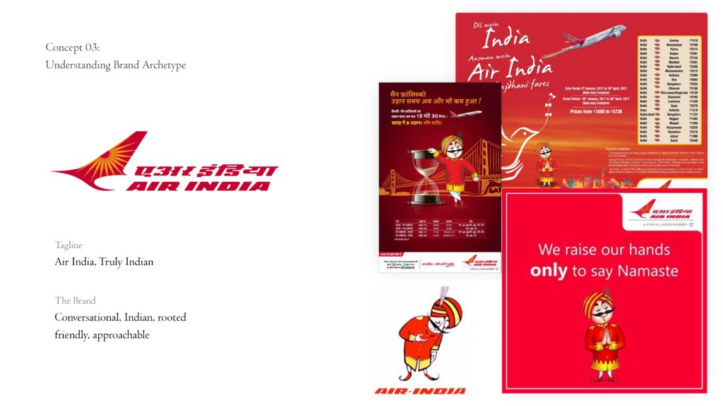
| Concept 03 | Rooted, Friendly, Conversational | Cultural, Localized |
Concept 1:
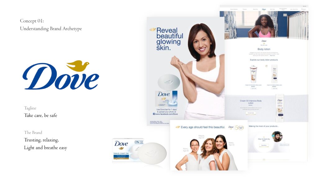
Route 1
Route 2
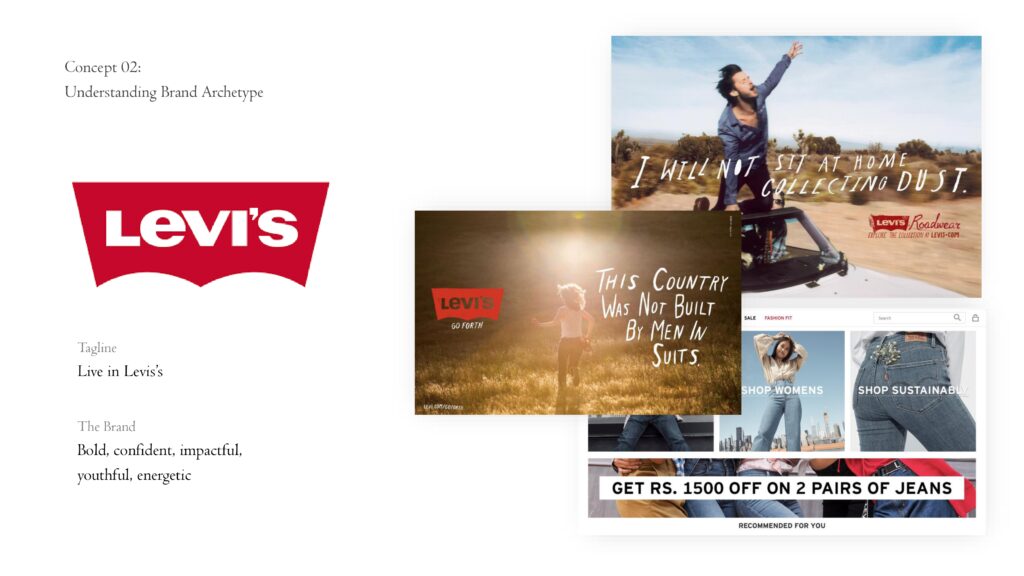
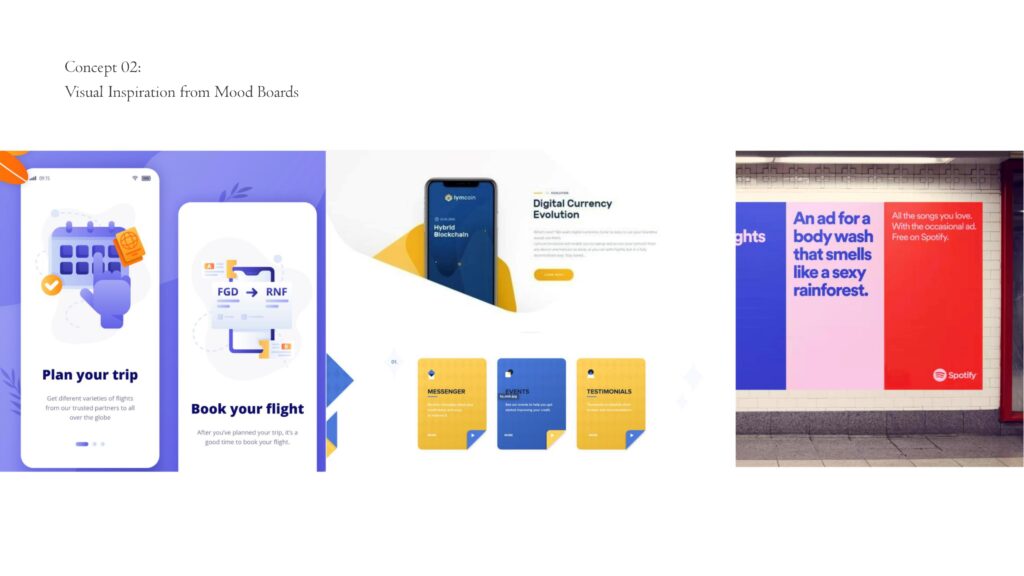
Concept 2: References and Moodboards
Route 3
Route 4
Concept 3: References and Moodboards
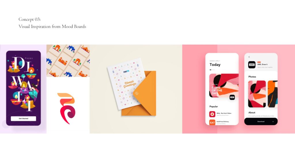
Route 5
Concept 4: *Just another design exploration that caught my eye
Route 6
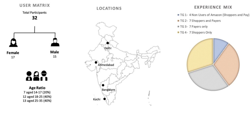
3. Testing
Survey Process
Tested Stimuli:
Key Inputs Captured:
Results & Insights
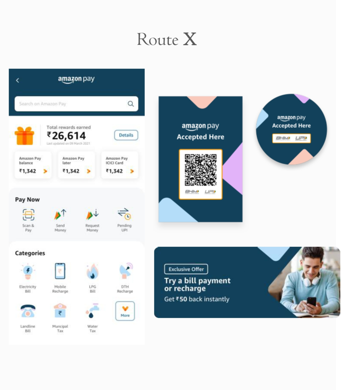
Route X – Visually Strong but Less Engaging
- Considered professional and clear, especially for offline signage
- Perceived as too formal and not youthful enough
- Preferred by older users for QR and POS visibility
- Scored lower on emotional connection and vibrancy
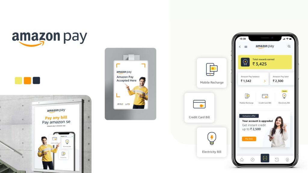
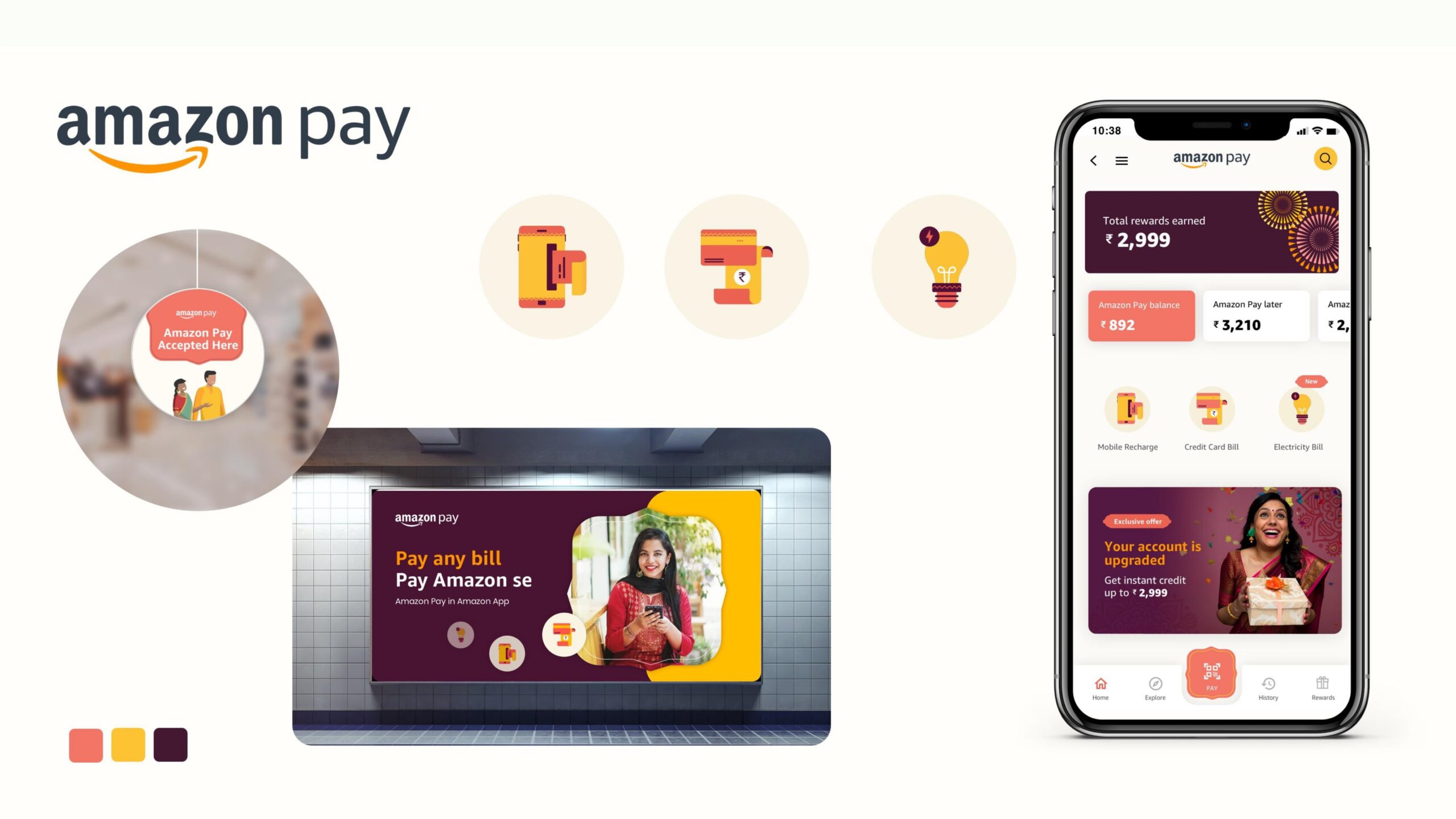
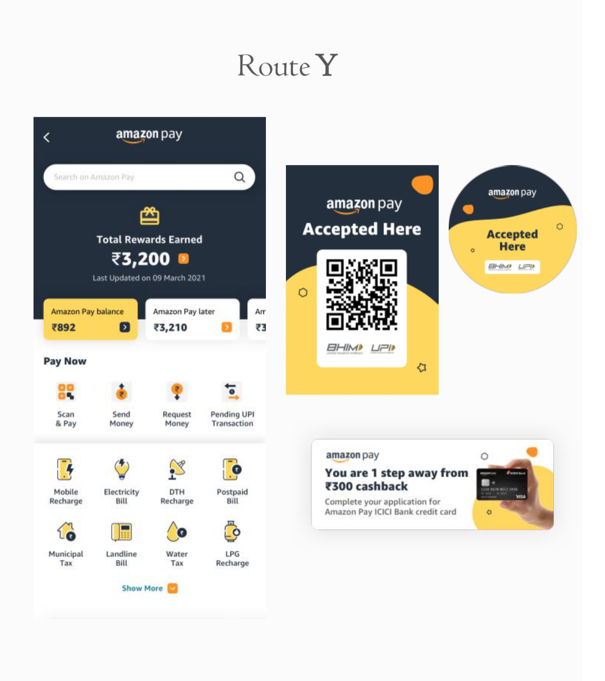
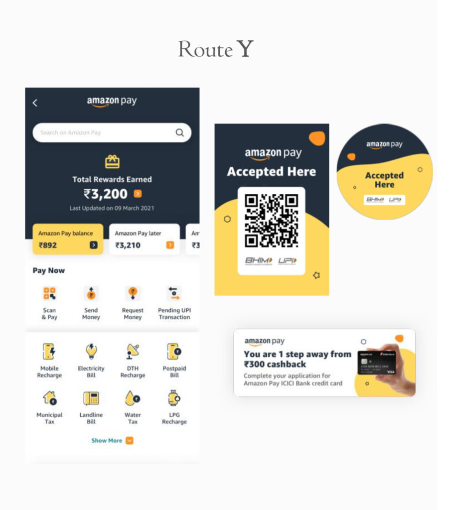
Route Y – Strongest Overall Performer
- Top-rated for trust, clarity, and Amazon brand alignment
- Preferred by all user groups, especially for in-app UI and offline banners
- Icons and compact layout were called out as intuitive and easy to navigate
- Dark blue + yellow color palette was seen as professional yet lively
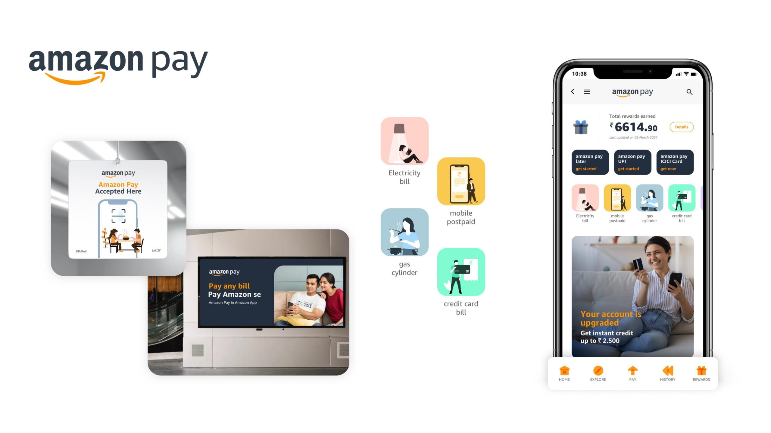
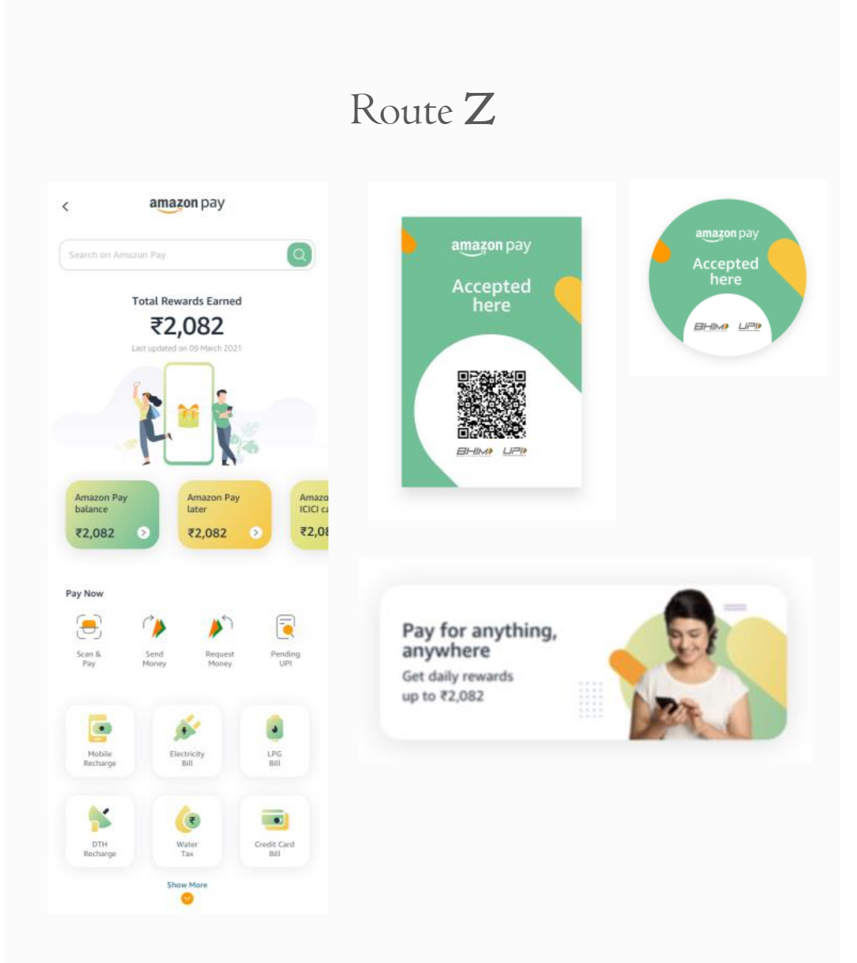
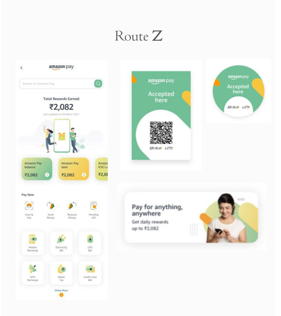
Route Z – Youthful & Unique
- Rated highest in terms of playfulness and visual freshness
- Strong preference from younger users (18–25 age group)
- Green and yellow tones evoked a “summer, happy vibe”
- However, perceived as less trustworthy and not as intuitive due to softer icon contrast
Results & Insights
Route Y – Clear Winner in Trust & Usability
- Rated highest overall for:
- Trustworthiness
- Ease of navigation
- Brand recognition
- Users liked the bold color contrast, outlined icons, and compact layout
- Felt closely aligned with Amazon’s brand due to yellow + dark blue palette
What Users Said:
Route Z – Strong on Youthfulness, Weaker on Trust
- Users aged 18–25 appreciated its playful, fresh look
- Green & yellow palette, rounded shapes, and illustrations gave it a friendly vibe
- However, some users felt it was:
- Too light and “pale”
- Less intuitive in terms of navigation
- Not as aligned with Amazon’s visual tone
What Users Said:
Color Combination is ok, Dull Colors
I feel happy
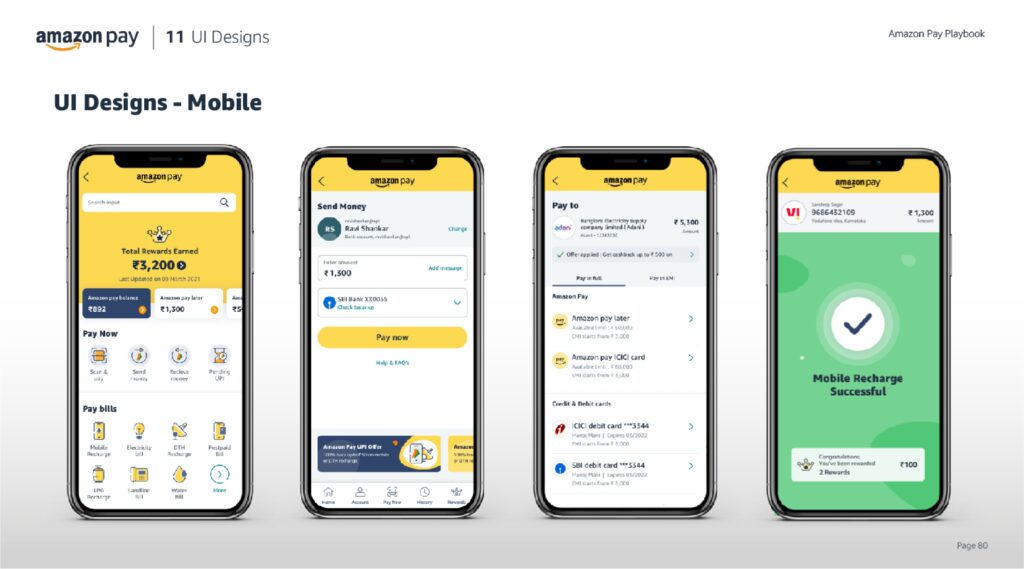
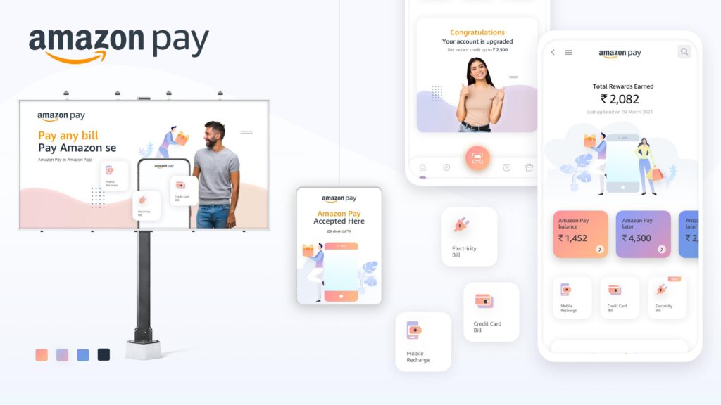
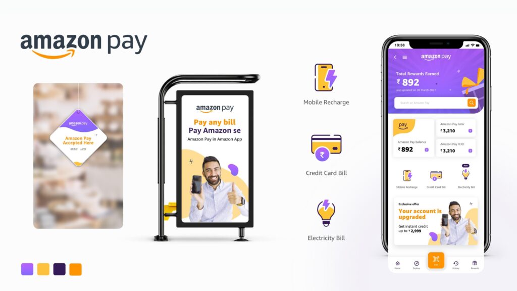
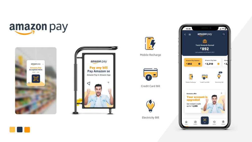
4. Final Designs
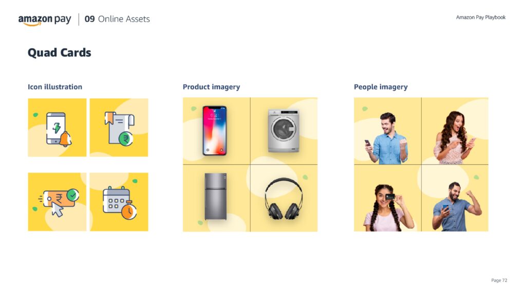
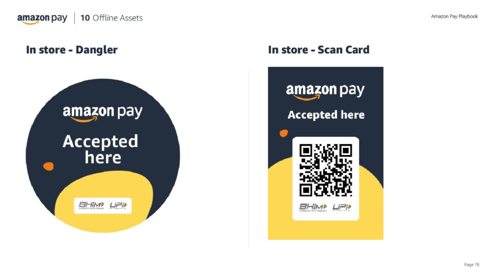
Assets Delivered:
- Marketing banners for app and offline campaigns
- In-store collaterals (QR standees, danglers, hoardings)
- Design playbook with scalable components and rules
What I Learned:
- How to balance trust and creativity in a fintech product
- Collaborating across product, research, and brand functions
- Collaborating across product, research, and brand functions